
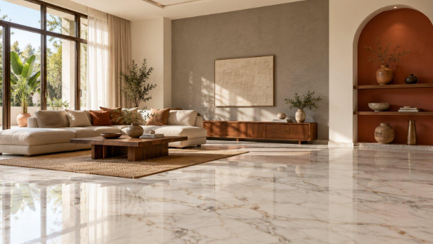
Marble makes a hall look grand, but it also makes paint choices harder. Cool stone can turn the wrong shade chilly, while warm stone can make a mismatched colour look muddy. The fix is simple, and it starts with the floor. Check the undertone first, then pick wall colours that go well with it.
Following that rule, any wall colour combination for hall spaces becomes much easier to get right, whether you prefer soft neutrals, warm earthy tones or deeper accent shades. This blog covers a few wall colour pairings for marble flooring, with finish and shade tips for each one.
Soft White and Warm Grey
This pairing suits white marble with grey veining. Soft white keeps the hall bright, while warm grey on a feature wall adds depth without competing with the stone. It also works well in halls with limited natural light, since the white bounces brightness around the room.
Use these pointers for a clean finish:
- Paint three walls in matt soft white and one in warm grey.
- Choose a grey with a beige undertone so it stays warm.
- Match the ceiling to the white walls.
- Avoid cool blue-greys, which can look flat beside white stone.
Cream and Terracotta
Cream walls suit beige and Botticino marble, since both share a golden undertone. Terracotta on an accent wall or an arch niche adds earthy warmth and gives the hall a lived-in, welcoming feel. Keep the cream soft so the terracotta stands out as the highlight. It is a popular choice for traditional and Indian homes.
Keep these tips in mind while painting:
- Choose a creamy off-white rather than a stark one.
- Apply terracotta in a satin finish to catch soft light.
- Keep the terracotta to one wall or niche.
- Test a patch in the morning and evening light.
Sage Green and Off-White
Green marble and sage walls echo each other naturally, but white marble also gains freshness beside this palette. Off-white on the remaining walls stops the green from feeling heavy. Sage also hides minor scuffs better than pure white. The result is a calm hall that feels connected to the outdoors.
These details make the palette easier to live with:
- Choose a greyish sage for a modern look.
- Use a matt finish to keep the green soft.
- Add wooden furniture for extra warmth.
Taupe and Cream
Taupe gives beige and brown marble a richer backdrop, while cream brightens the surrounding walls. They create a layered, neutral hall that suits both traditional and contemporary homes. A wall paint colour chart makes it easier to compare close neutrals side by side before you commit. Taupe also adapts well to changing light, shifting from warm in the evening to softer in the day.
Keep these points in mind when applying them:
- Use taupe on the wall behind seating or a console.
- Keep curtains and furnishings in matching soft tones.
- Pick a warm taupe for beige marble and a softer one for ivory.
- Choose satin or eggshell for easy cleaning in busy halls.
Navy Blue and Pale Grey
Deep navy creates a bold contrast against white or light grey marble. Pale grey on the other walls softens the effect and stops the hall from looking dark. This combination suits larger halls, where the navy has room to make a statement without closing in the space.
These pointers help you control the contrast:
- Limit navy to one wall or a panelled section.
- Choose a matt finish to avoid harsh reflections.
- Add brass or gold lighting to lift the tone.
Charcoal and White
Black or dark grey marble looks striking against crisp white walls. A charcoal accent wall repeats the depth of the floor and gives the hall a modern, gallery-style finish. White on the larger walls keeps the room open and bright. Cool-toned white works best here, as warm whites can look yellow beside dark stone.
Here is how to keep the space bright:
- Use charcoal on one wall only.
- Choose a matt white to reduce glare from the floor.
- Pair with warm white lighting to soften the contrast.
- Keep skirting boards white for a sharp edge.
Powder Blue and White
Cool marble in white or grey tones pairs well with powder blue, which makes a hall feel spacious and calm. White on the trims and ceiling keeps the blue light and crisp. It is a refreshing choice for halls that receive plenty of daylight.
These details help the combination look polished:
- Pick a blue with a faint grey base.
- Use white on doors and skirting boards for definition.
- Avoid bright blues, which can clash with veining.
- Test two blues on the wall before choosing one.
Conclusion
A marble floor already gives your hall plenty of character, so let the walls support it. Match warm stone with warm shades and cool stone with cool ones, then add contrast through a single accent wall. Always test samples on the wall itself, not just on paper, since light changes how colour looks throughout the day. Get these basics right, and the result will feel cohesive, bright and welcoming, with your marble looking as good as the day it was laid.